The system problem
50+ screens. 9,000 users.
No design system.
Every screen was built from scratch.
I replaced 7 steps with 3, and built the design system that made it stick.
The Problem
Built by engineers, used by everyone
The Axxess Employee Support Application was the primary tool for sales, accounting, and customer experience teams managing 70+ US healthcare agencies. Built by engineers based on PM specifications with no designer involved, it met every content requirement, but was painful to use.
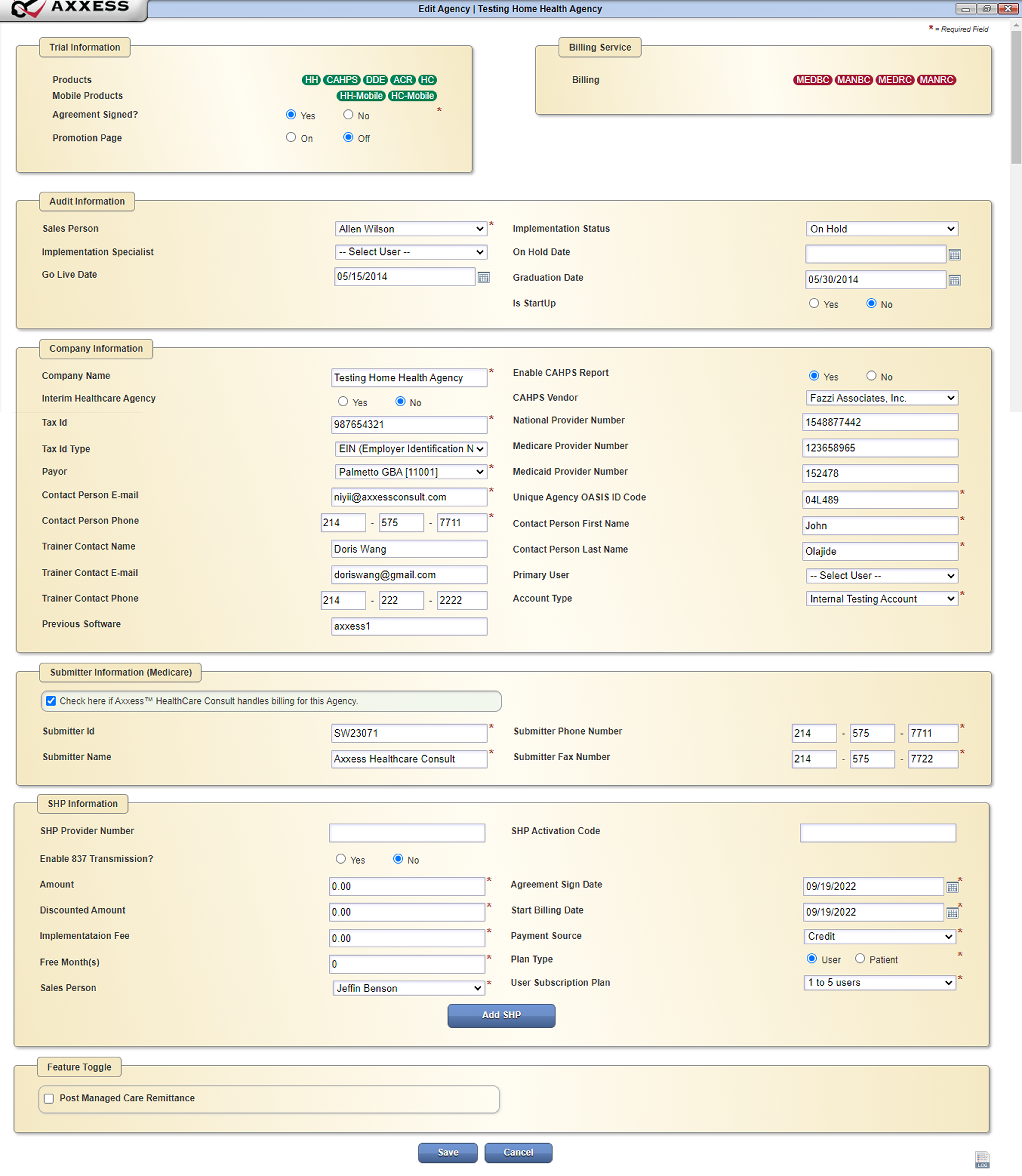
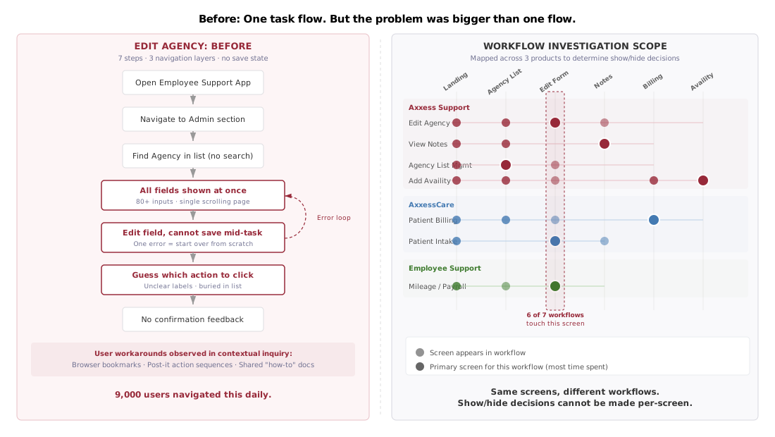
The interface presented all inputs as a single overwhelming step, actions weren't intuitive, and if you filled a form and couldn't save, you started from scratch. Task completion rates were low, and operational efficiency suffered across teams that depended on the application daily.
UI Audit
Analyzing 50+ screens across 3 products
Before proposing solutions, I conducted an in-depth analysis of the existing UI, mapping problems across the Employee Support Application, AxxessCare, and Axxess Support products. The audit revealed that the same screens served different workflows across products, which meant a screen-by-screen redesign was impossible. The problems were structural.
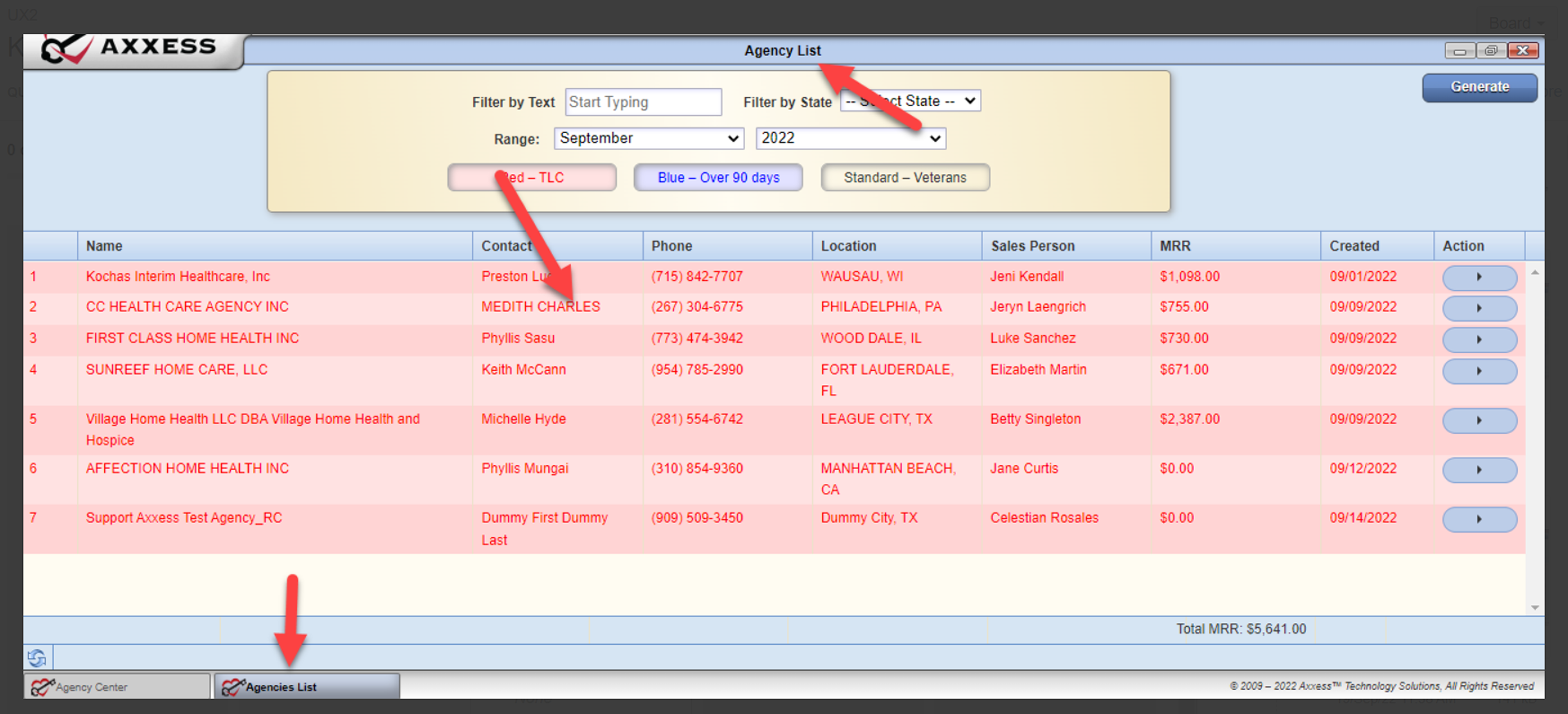
Key finding: I mapped 7 workflows across 3 products and discovered that 6 of 7 workflows touched the same Edit Form screen. You couldn't fix screens in isolation. The system needed a shared foundation.
Research
Four methods, one finding: the problem was structural
To validate the issues discovered in the UI audit, I conducted interviews with 5 key internal users across departments: two sales representatives, one accountant, and two customer experience specialists. I asked about daily usage patterns, workarounds for the current UI, and experiences with similar tools on other platforms.
What users told us
Research methods
User interviews with 5 internal users. Contextual inquiry observing real user workflows. UI heuristic analysis across 50+ screens. Cross-product workflow mapping across 7 task flows and 3 products to understand shared screen dependencies.
Design Goals
From problems to principles
Research and the workflow audit converged on four design goals that would guide every decision from system architecture to component design.
Consistency across products
Create a shared design language that works across Employee Support, AxxessCare, and Axxess Support, so users switching between products don't have to relearn the interface.
Reduce visual clutter
Improve information hierarchy so users can scan, find, and act without cognitive overload. Surface what matters, hide what doesn't.
Discoverable actions
Group frequently used actions and make them immediately visible. No more clicking around hoping to find the right button.
Fewer steps, faster tasks
Reduce the steps required to complete core workflows. The primary flow took 7 steps. The goal was to bring it under 4.
The pitch: I proposed building a design system to the PM, who pushed back: "too much effort within our limited timeline." My argument: setting the foundation now makes every future redesign faster and helps developers maintain consistency. The PM agreed. Engineering endorsed it. Clear specs meant faster implementation with no handoff meetings needed.
The Design System
One system. Eight products. Zero backend changes.
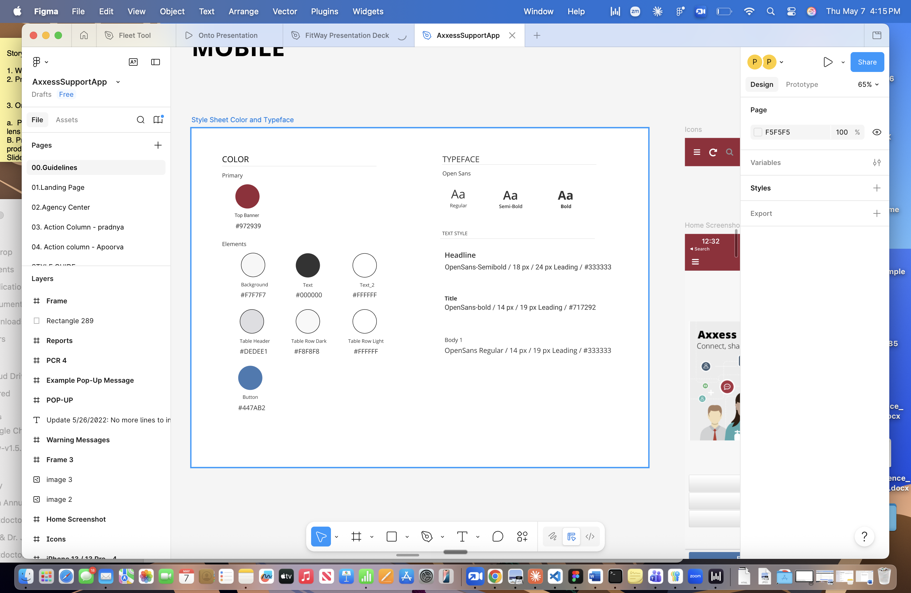
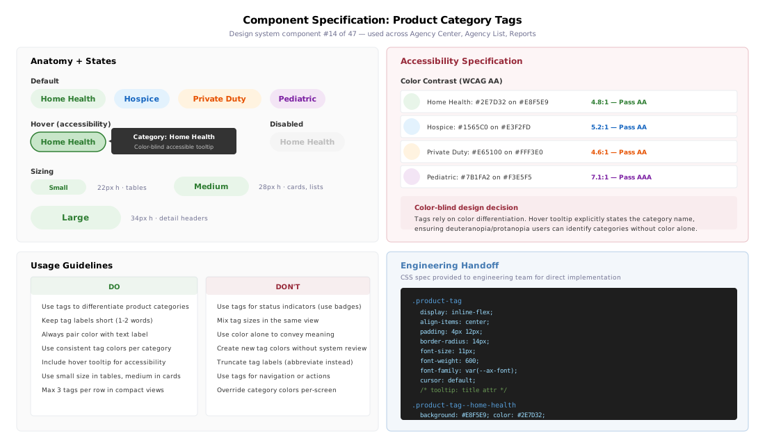
I collaborated with the design team to create a comprehensive style guide, the first shared design resource in Axxess history. The system included 47 components, design guidelines, and UX specifications covering everything from typography to screen layouts. It was adopted across 8+ Axxess products and became a foundational tool for both design and engineering teams.
Cross-Product Adoption
One system across three platforms
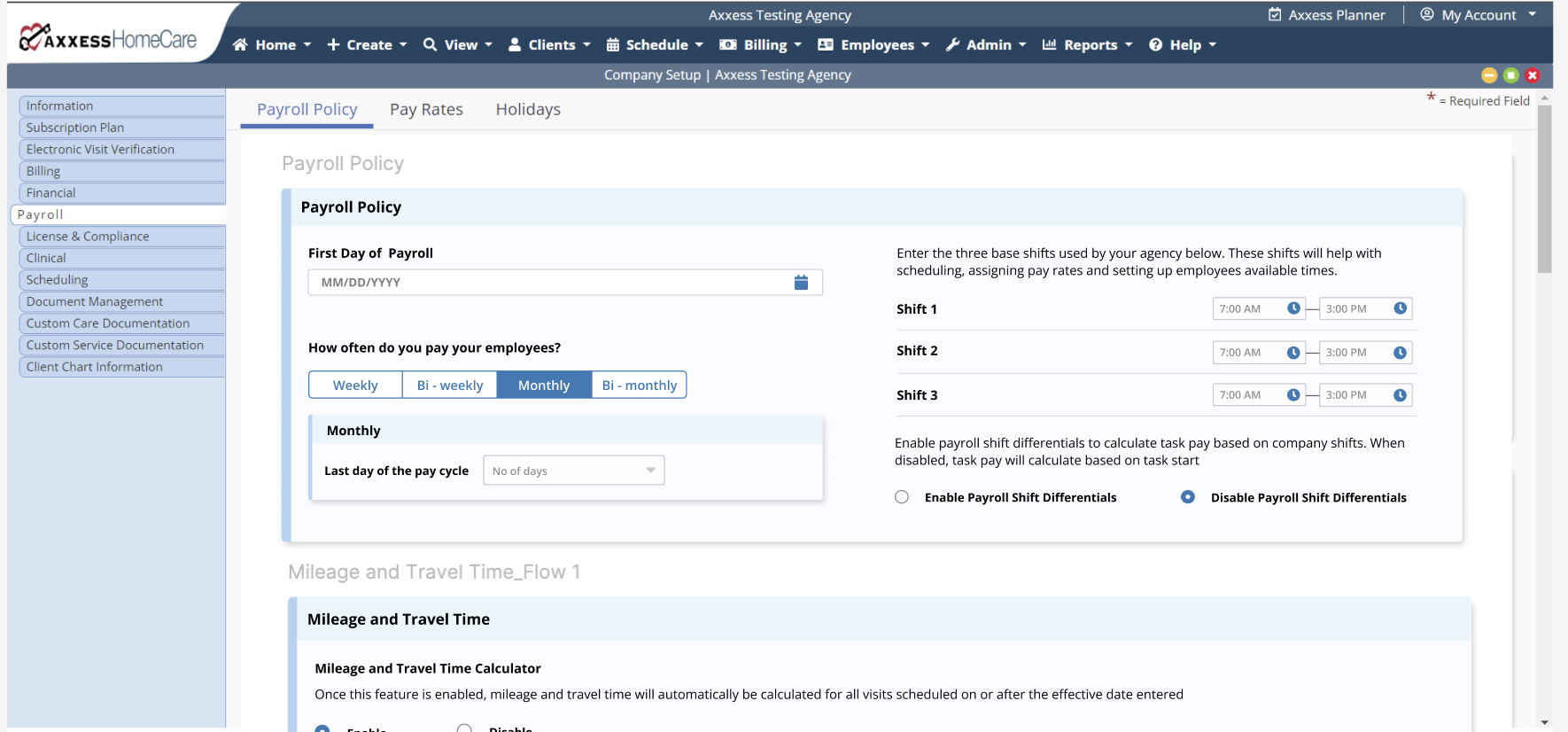
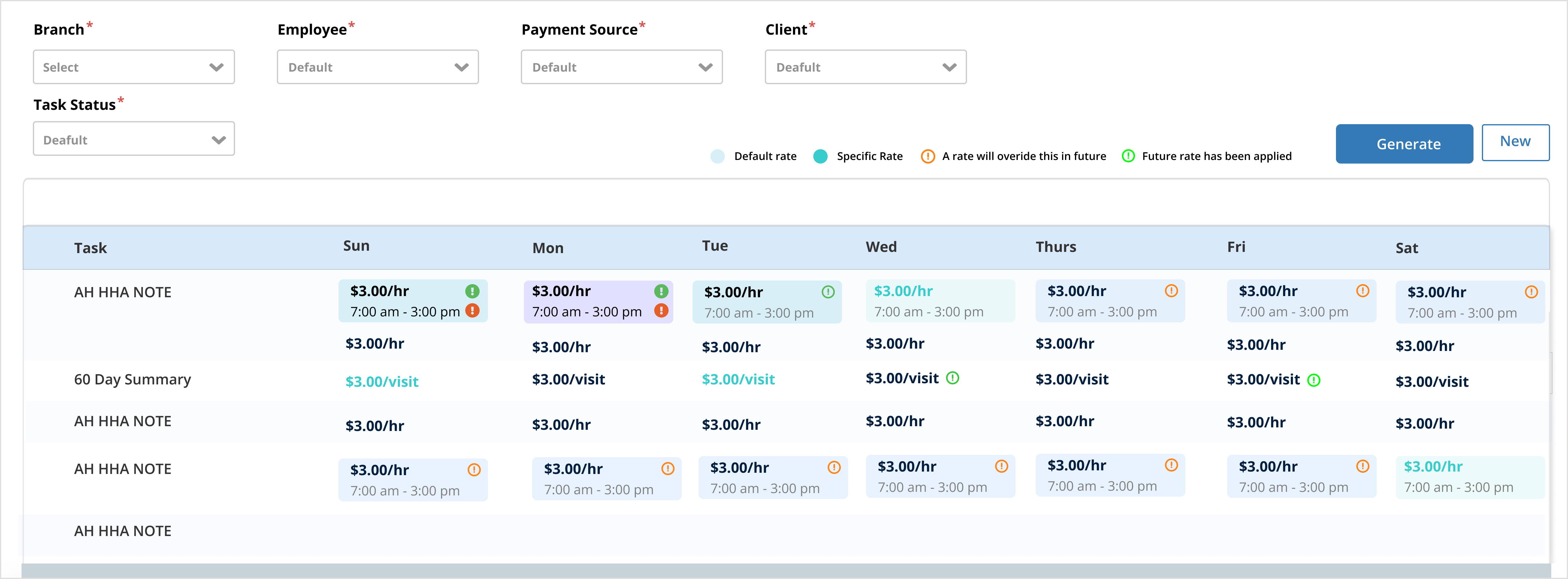
The design system wasn't just for Employee Support. I worked with teams across AxxessCare and Axxess HomeCare to extend the same component library, color tokens, and interaction patterns. The result: users switching between products encountered a consistent visual language and interaction model, no relearning required.
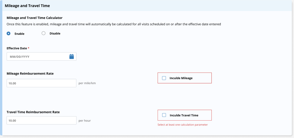
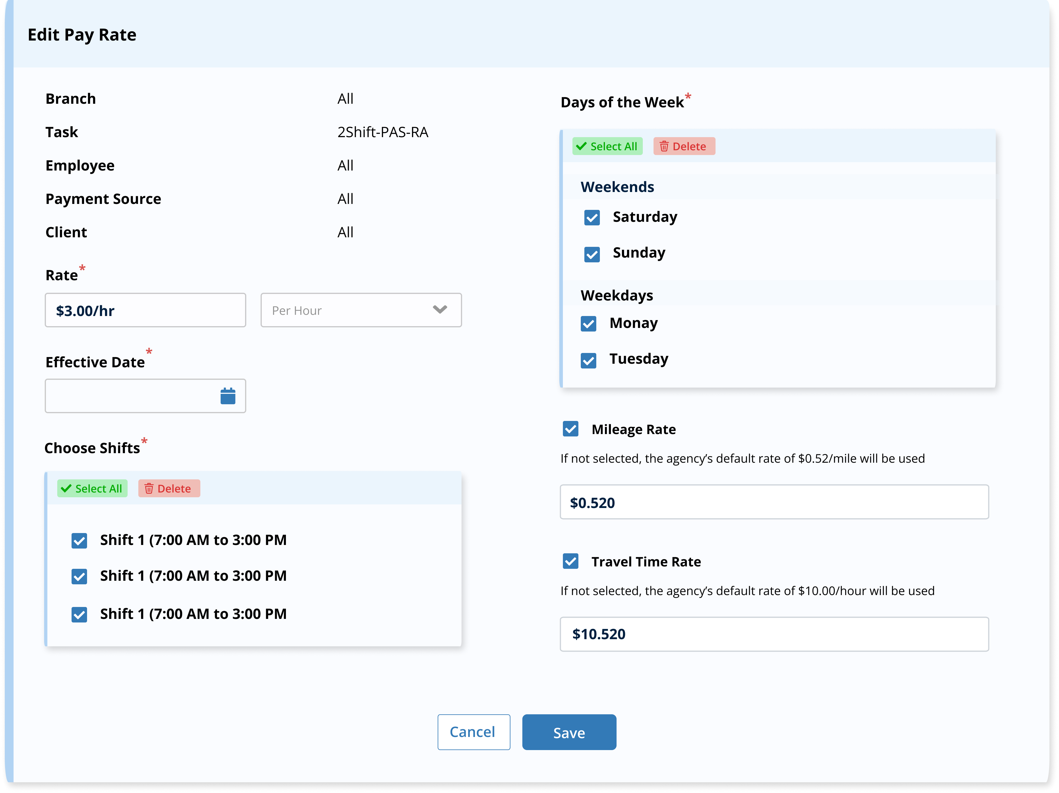
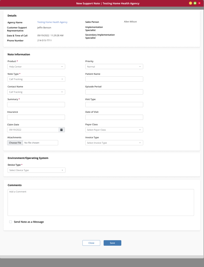
Scale: 47 components designed. Adopted across 8+ Axxess products. The first shared design resource in Axxess history, and the process I built to govern it kept it alive after I left.
The Redesign
Agency Center: the most-used screen, redesigned first
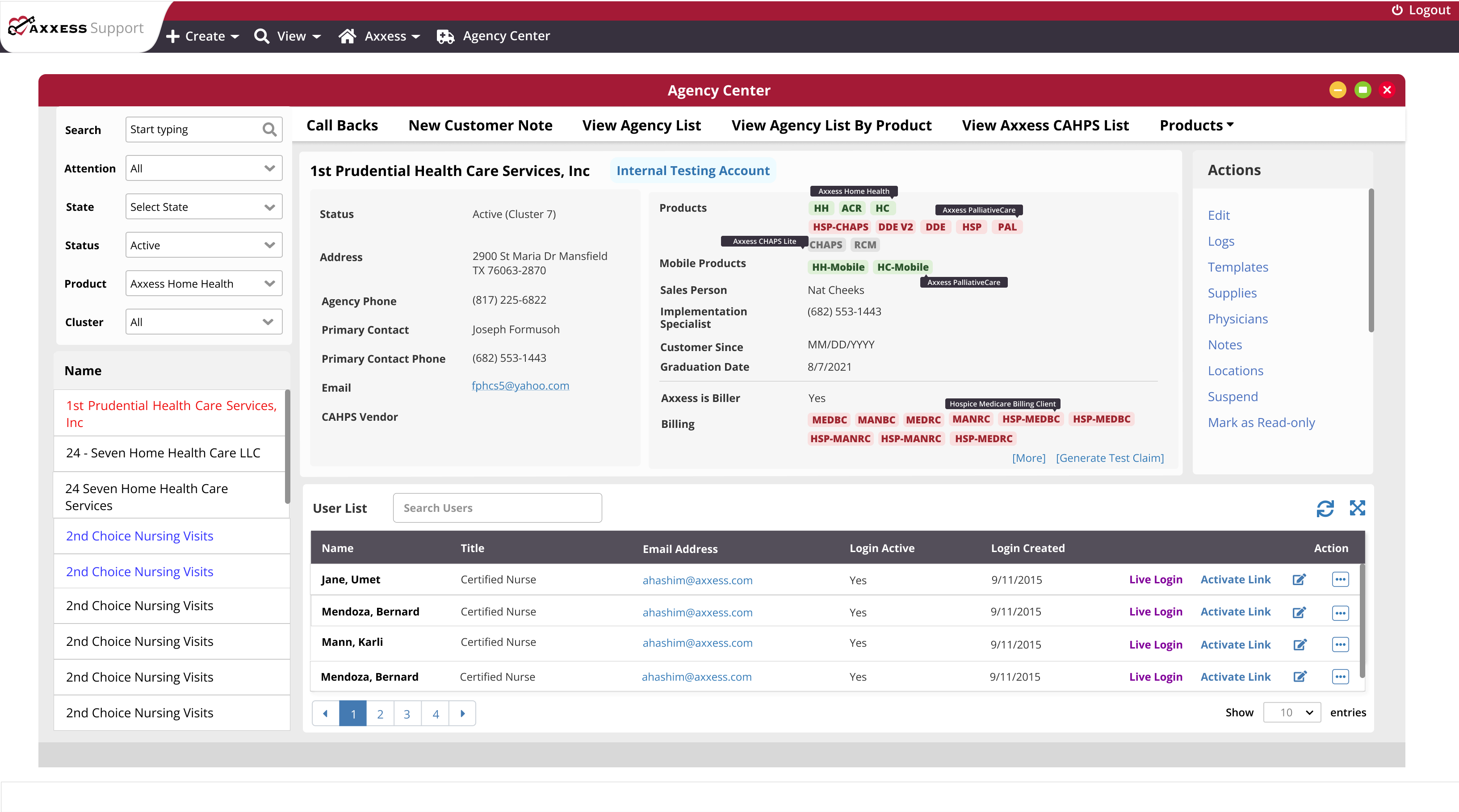
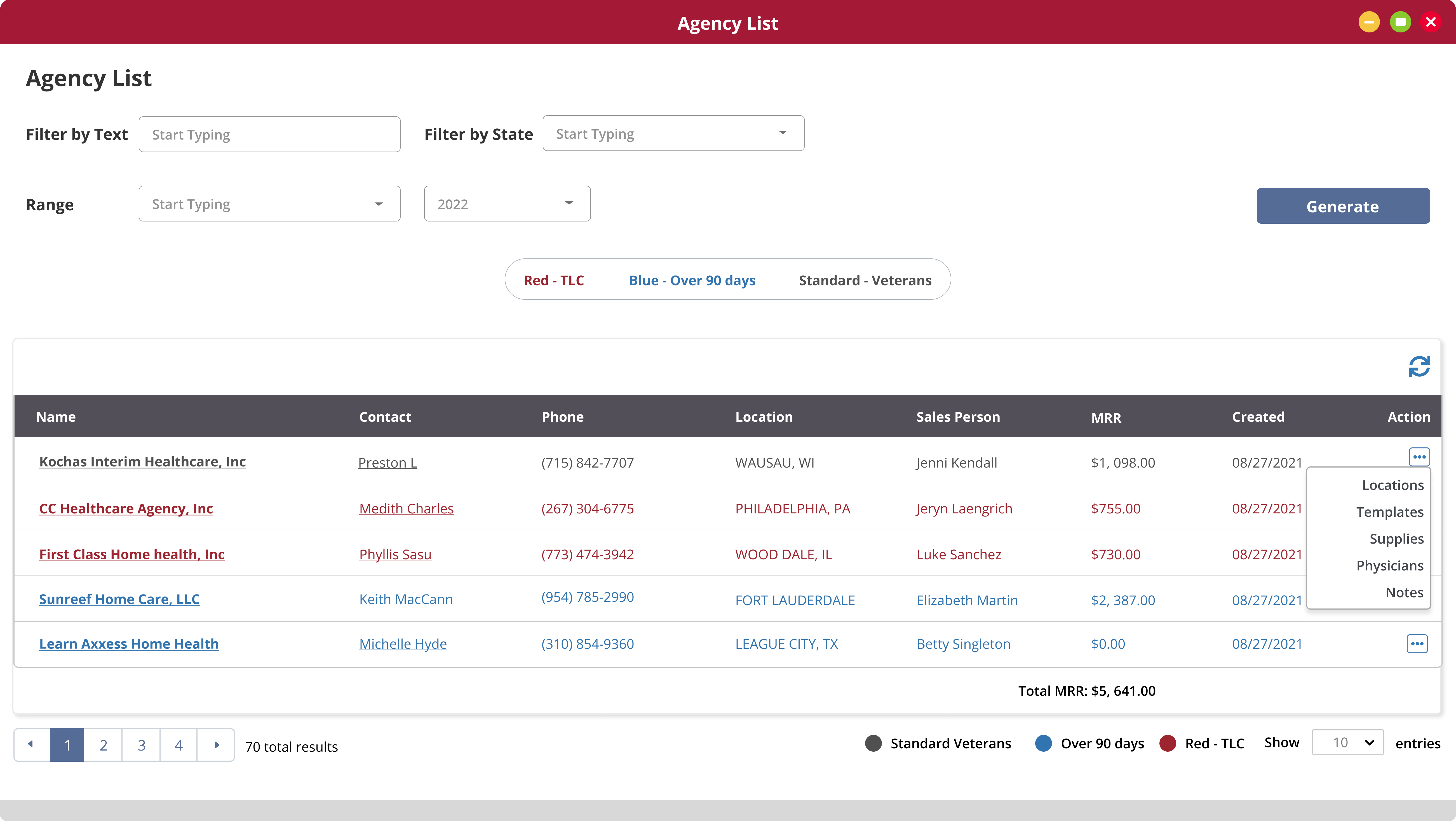
As lead, I managed the full-cycle UX for 9,000+ internal users. The Agency Center was the highest-traffic screen. Every workflow started here. The redesign introduced a category tab bar for quick task access, reorganized information by priority, and added colored tags for product categories with hover states for accessibility.
Before & After
Key design decisions
Category tab bar as navigation shortcut
Rather than forcing users through a linear flow, the tab bar provides direct access to task categories. Users jump to what they need without scrolling through irrelevant sections.
Information reordering by usage frequency
Sections reorganized based on contextual inquiry data, the most-accessed information surfaces first. Pop-up windows for detailed edits keep the main view scannable.
Simplified action column
Frequently used actions placed first. A "more options" overflow hides less-used actions. Refresh and expand icons added for table management, patterns users recognized from other enterprise tools.
Feature Improvements
Deployment 2.0: design parity across the product
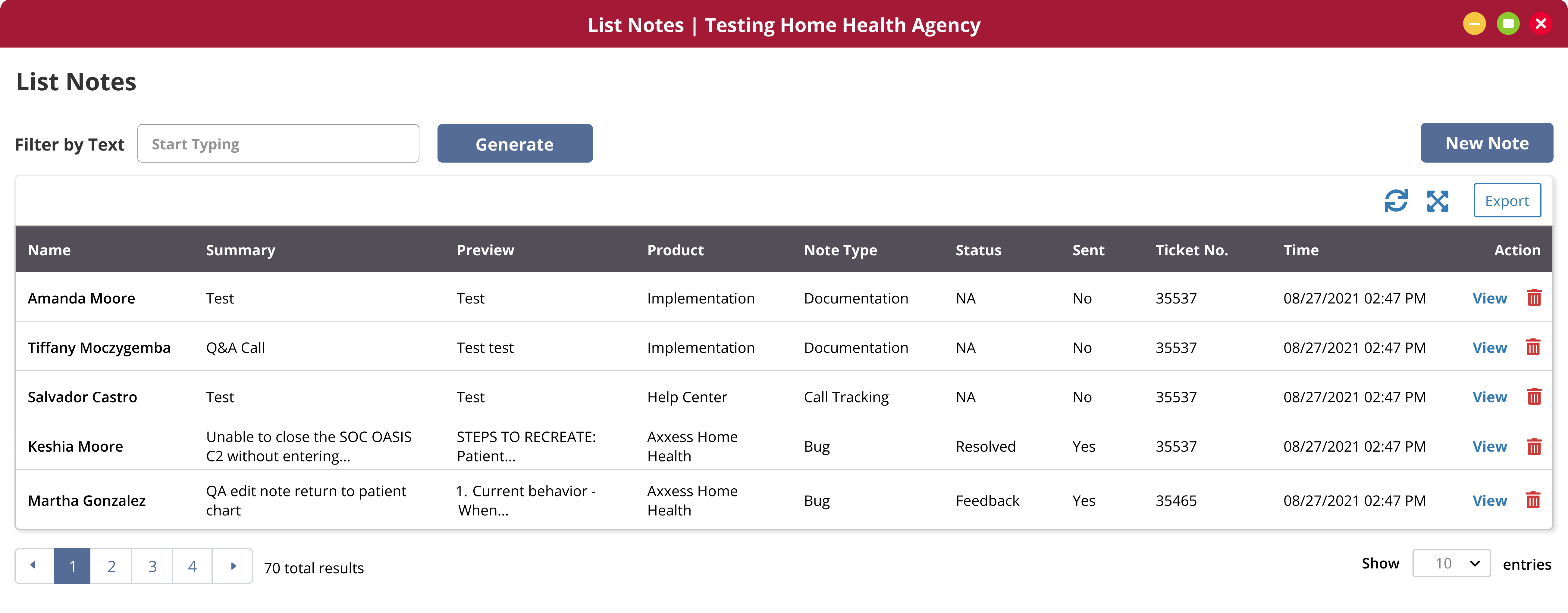
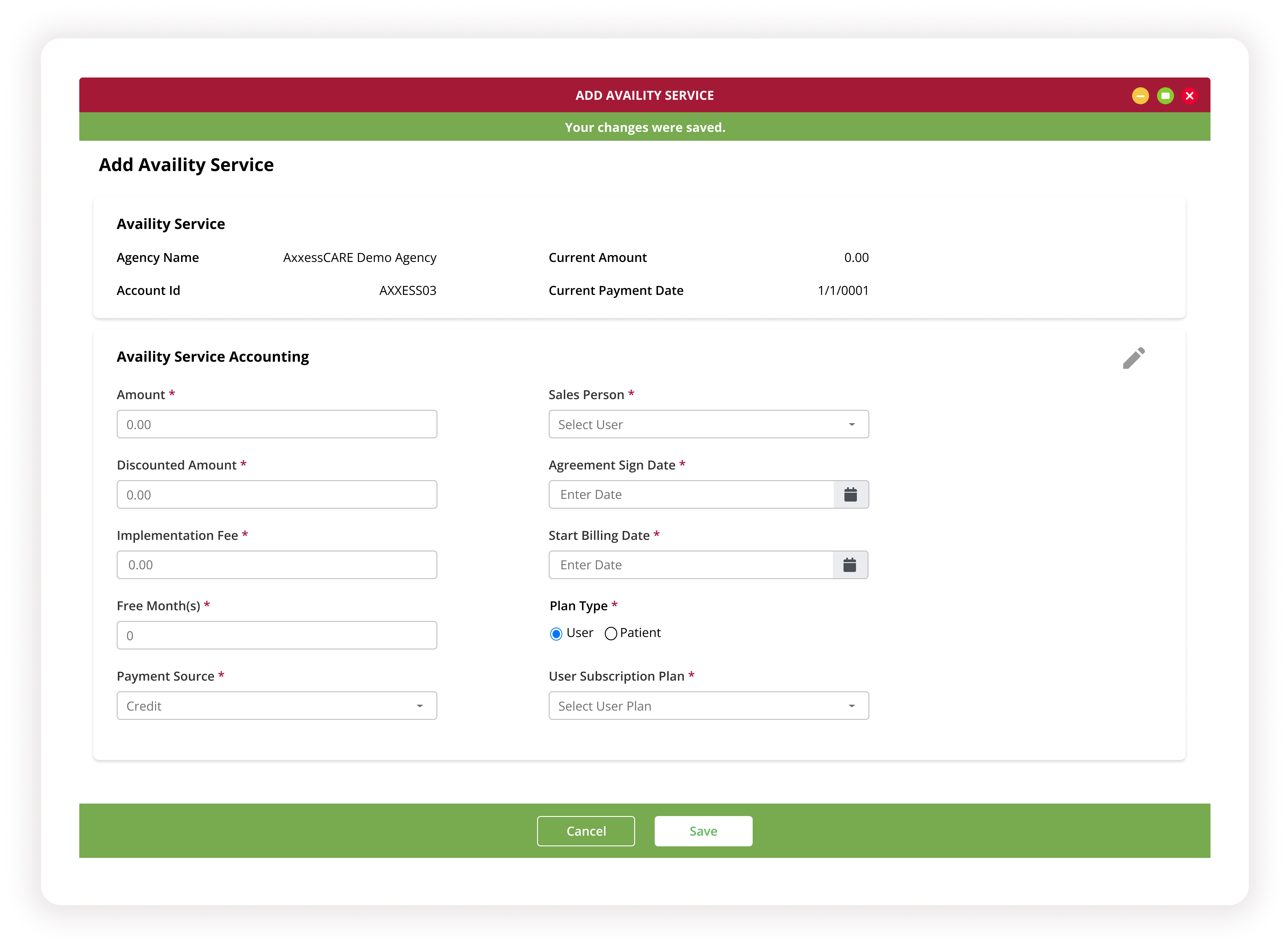
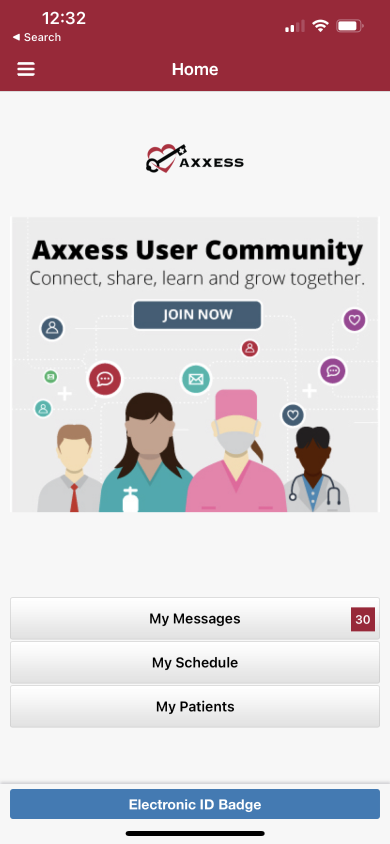
After the Agency Center shipped, I extended the redesign to the Landing Page, Agency List, and Agency Physicians sections. Through additional user interviews and contextual inquiry, I identified pain points specific to each section and made structural improvements to navigation, information architecture, and interaction patterns.
Results
The redesign shipped. The system stayed.
| Metric | Before | After | |
|---|---|---|---|
| Primary task flow | 7 steps with error loops | → | 3 steps with save states |
| Form abandonment | Frequent (no autosave) | → | Eliminated through save states |
| Design system adoption | No shared design resource | → | Adopted across 8+ products |
| Report flows standardized | 40+ inconsistent flows | → | 40+ flows unified under one system |
| Component library | None | → | 47 reusable components |
Tested with 5 internal users from the original research cohort. Task completion with zero abandonment. The CX team lead described it as the most significant usability improvement in the product's history.
On measurement: We didn't have formal analytics infrastructure pre-redesign, that was part of the problem. The design reduced the primary flow from 7 to 3 steps, eliminated data loss from form abandonment, and the system was adopted across 8 products. Building proper measurement infrastructure from day one is something I'd prioritize next time.
Reflections
What I'd do differently
Start with the system, not the screens
I discovered the need for a design system through iteration. The first round was a visual reskin, the second a structural restructure, and only the third addressed the root cause. Next time, I'd invest in the system architecture before touching a single screen.
Instrument from day one
Without pre-redesign analytics, I couldn't quantify the improvement with hard numbers. The 7-to-3 step reduction and zero-abandonment rate tell the story, but having baseline metrics would have made the case even stronger, and would have guided prioritization during the project.
Document governance earlier
The design system's adoption across 8 products succeeded because I built a governance process: contribution guidelines, version control, and engineering alignment. But I built it after the system existed. Starting governance planning alongside component design would have saved rework.
My impact
Set project goals by defining core problems. Built consensus with a multi-functional team by presenting research-backed design rationale. Conducted usability testing from planning through moderation to synthesis. Created 47 components and 22 illustrations. Delivered design patterns, detailed specs, and an accessibility guide. Enhanced collaboration between design and engineering by providing a detailed guide for code retrieval and concise design annotations.