The search problem
12,847 signals across
217 tools. Four data channels.
The engineer needs one answer.
I designed the platform that replaced 12 dashboards with one question.
The Problem
Drowning in data, starving for answers
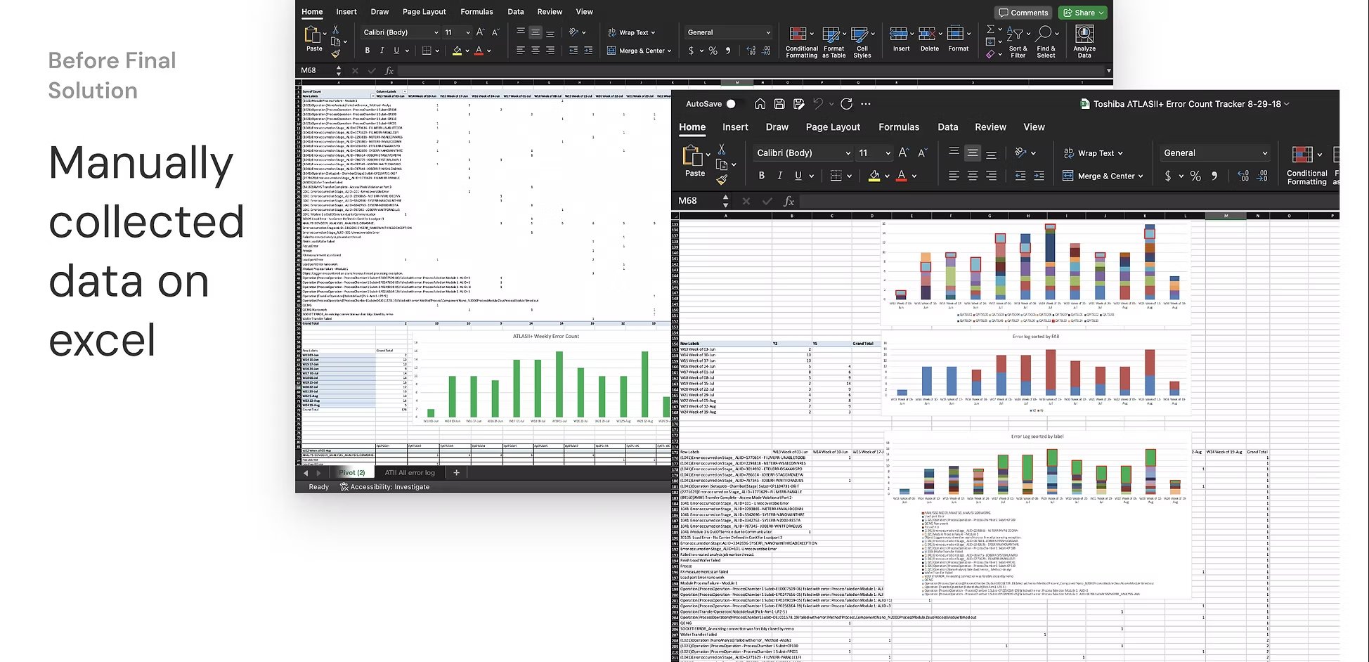
Semiconductor fabs generate terabytes of equipment data daily across four independent channels: Autotest, FDC, Health Index, and Metrology. Before Discover Fleet, engineers needed to manually query each system, export to Excel, merge datasets by hand, and hope the timestamps aligned. A single root-cause analysis could consume an entire shift.
The tools existed. The data existed. But getting from a question to an answer required crossing 12 disconnected dashboards, 3 export formats, and a data team with a 4-6 hour turnaround.
Research
Going where the data lives
I spent a week embedded in the fab, shadowing field service engineers during shift starts, watching them switch between Tableau, JMP, Excel macros, and a custom MATLAB script one engineer had built himself. I conducted 12 interviews across four roles to understand not just what they needed, but how they thought about the data.
Four roles, one platform
Research methods
Field observations and shift shadowing. Design thinking workshops with product and engineering. Failure-mode analysis tracing cases where missing parameter correlation delayed fixes by days. Data forensics across 25GB+ of FDC logs per site. Artifact studies of the Excel macros, Tableau dashboards, and JMP models engineers built themselves.
Key insight: Engineers weren't lacking data. They were lacking a unified way to ask questions across data channels without needing to know which channel held the answer. The problem was structural, not informational.
Prioritization
From research clusters to an MVP
I synthesized the research findings into four pain clusters: Visibility (fragmented data across fabs), Autonomy (dependency on data teams), Predictive Intelligence (reactive instead of proactive), and Knowledge Sharing (tribal knowledge trapped in individual engineers). These clusters became the foundation for prioritization.
Workshop principle: Clarity before prediction. We couldn't build predictive intelligence until engineers trusted the data foundation. The design workshop unified product, design, and engineering around a phased strategy: dashboard first, query builder next.
Fleet Dashboard
Unified health view across tools
Query Builder
Self-serve data exploration
AI Layer
Predictive anomaly detection
This phased strategy de-risked delivery and built adoption momentum early. The dashboard solved the fragmented visibility issue first. The Query Builder empowered engineers with self-serve root-cause analysis, freeing the data team for higher-value modeling.
Exploration & Ideation
Sketching the structure before the screens
Before opening Figma, I ran brainstorming sessions with engineering leads and the product team at whiteboards. We mapped data flows across the four channels, sketched query interaction models, and debated how engineers would move from a fleet-level view down to a single parameter. These sessions surfaced critical constraints: the fact that engineers needed to see data across channels simultaneously, not sequentially.
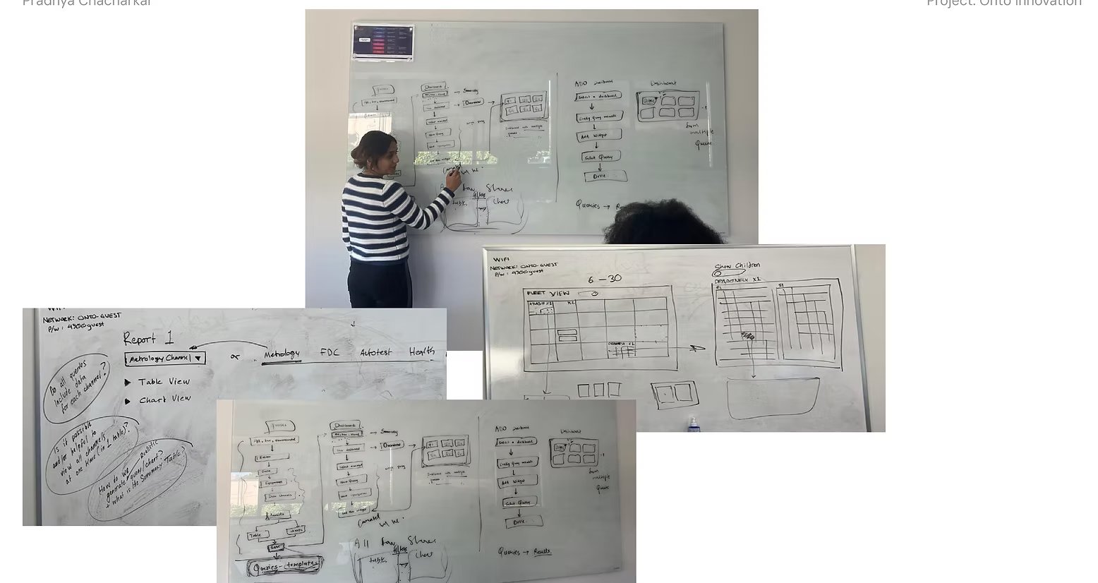
The whiteboard sketches became the blueprint for three key architectural decisions: a channel-agnostic query model (so engineers don't need to know which system holds the answer), a hierarchical drill-down (Tool → Subsystem → Parameter), and a tile-based dashboard that maps to the physical fab layout. Each decision was validated against the pain clusters from research before moving to digital wireframes.
The Dashboard
A health index for every tool in the fleet
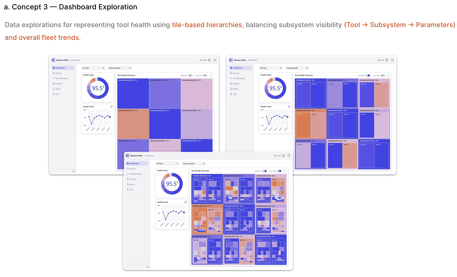
The dashboard replaced 12 disconnected views with a single command center. Each tool appears as a color-coded tile reflecting its health index score (0-100%), calculated from Autotest results, FDC signals, and metrology data. Engineers scan 50+ tools in seconds and drill down with a single click.
Design decisions
Health gradient over status icons
A continuous color gradient (red → amber → green) communicates severity faster than discrete status labels. Engineers scan by color at arm's length. The gradient follows ISA-101 HMI standards for industrial interfaces.
Tool-level tiles, not aggregated charts
Engineers fix individual tools, not statistical summaries. Each tile is a physical machine they walk to. The tile grid maps to their mental model of the fab floor.
Adaptive KPIs update dynamically using anomaly detection and trend forecasting models. Subsystems with projected error risk are subtly pre-highlighted based on AI forecasts, giving engineers a head start on emerging issues.
Query Builder
From 4-6 hours to under 5 minutes
Before Discover Fleet, querying equipment data meant filing a request with the data team, waiting hours for an export, and manually correlating results across channels. The Query Builder put that power directly in the engineer's hands.
Three concepts explored
Designing the parameter search
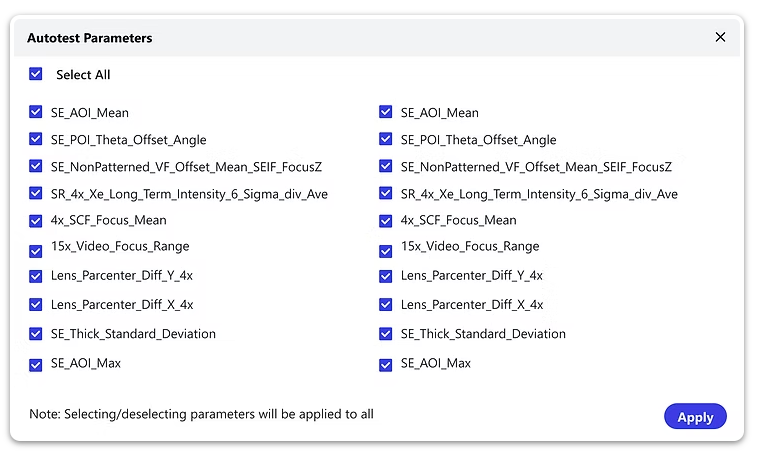
With 1,000+ autotest parameters across equipment types, parameter selection was the biggest friction point. I designed a searchable parameter picker with smart grouping. Engineers could filter by recent use, commonly selected parameters, or custom categories. The modal shows parameters in a scannable two-column layout with select-all controls, while the search dropdown surfaces recently used and commonly selected parameters first to reduce selection time.
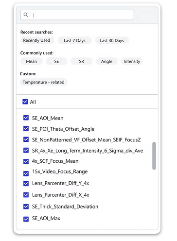
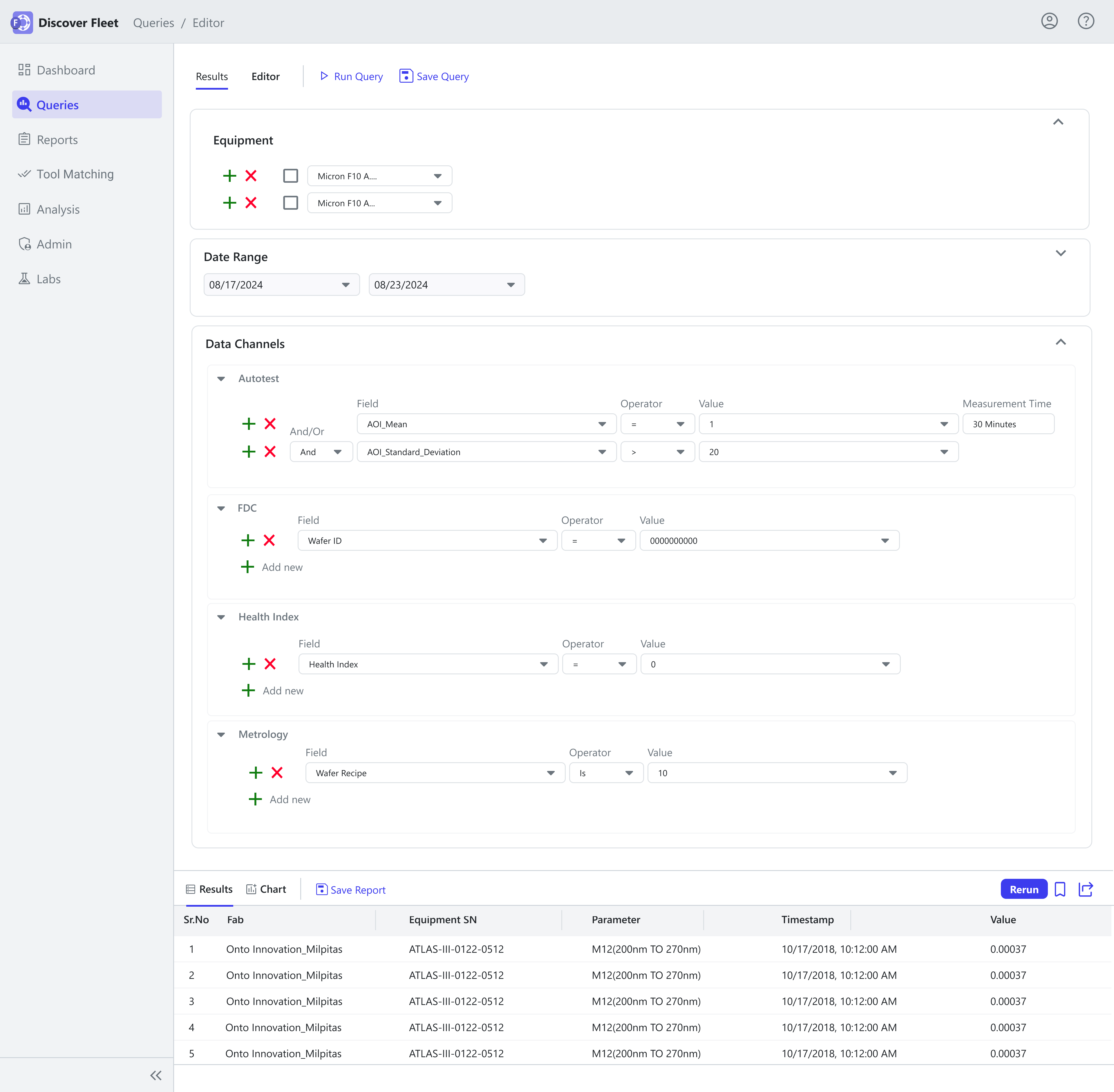
The shipped Query Builder uses AND/OR boolean field selection across all four data channels. Engineers select equipment, choose parameters from 1,000+ options using tag-based search, set conditions, and get results in seconds. No SQL. No data team. No waiting.
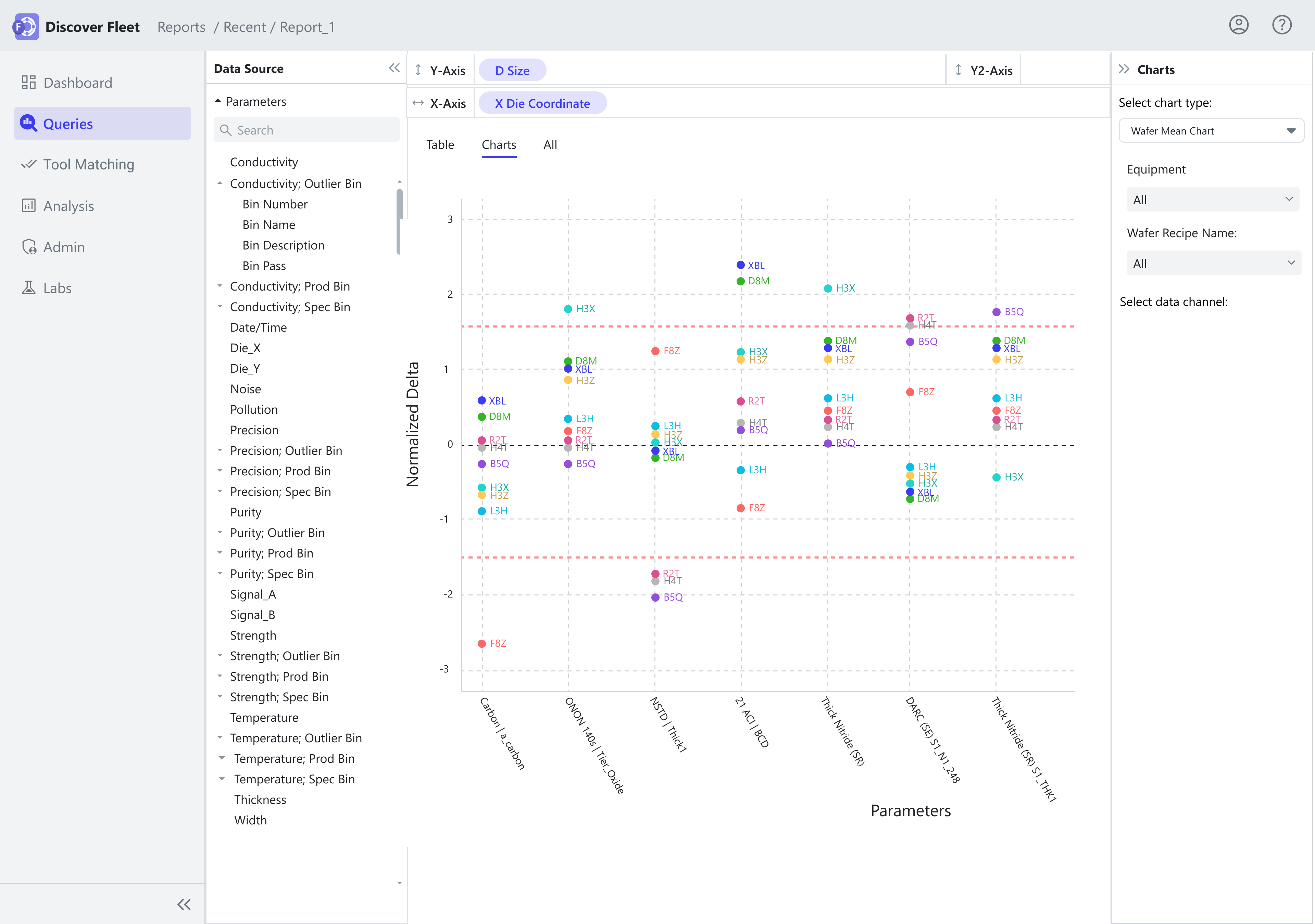
Design decision: I added a chart playground (multiple chart types from one query) based on competitive analysis of Tableau and Power BI. Engineers build charts daily for analysis reports. The system pre-fills chart configuration; the engineer customizes. This reduced setup friction without removing control.
Drill-Down Journey
Tool → Subsystem → Parameter → Root Cause
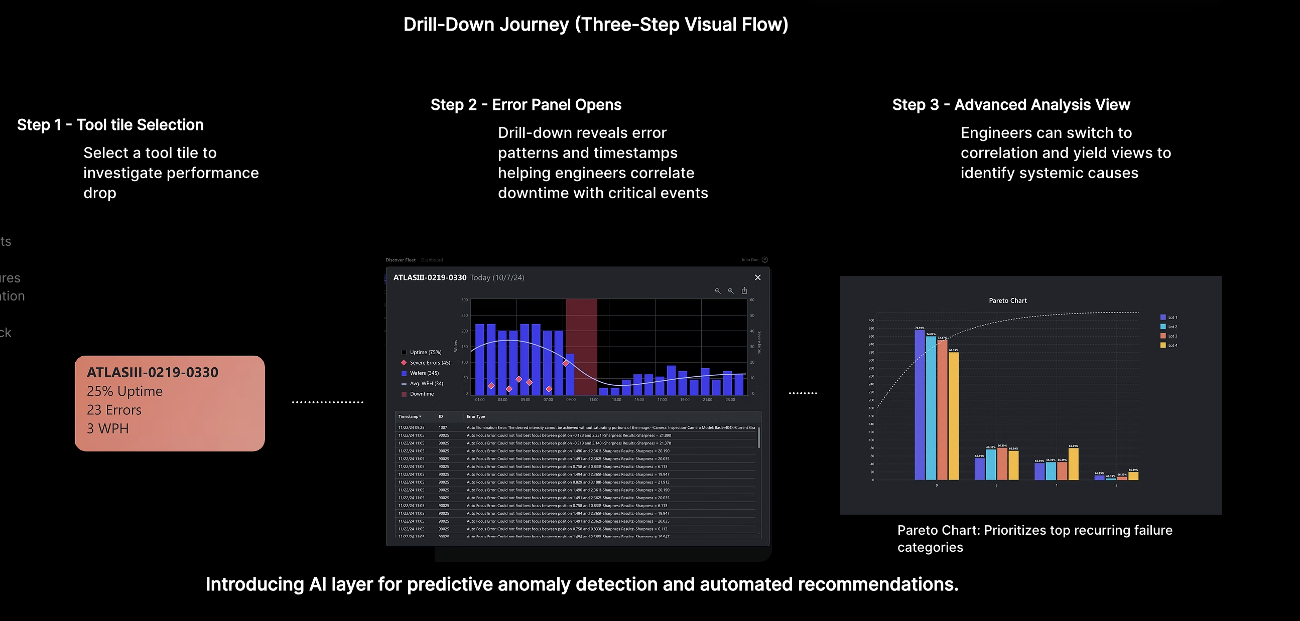
The three-step drill-down hierarchy mirrors how engineers think about equipment problems. They start broad (which tool?), narrow to a subsystem (which component?), and investigate specific parameters (which signal is drifting?). Each level reveals more detail without losing context of where you are in the hierarchy.
Tool Selection
Click a health tile to investigate
Error Panel
Patterns, timestamps, correlations
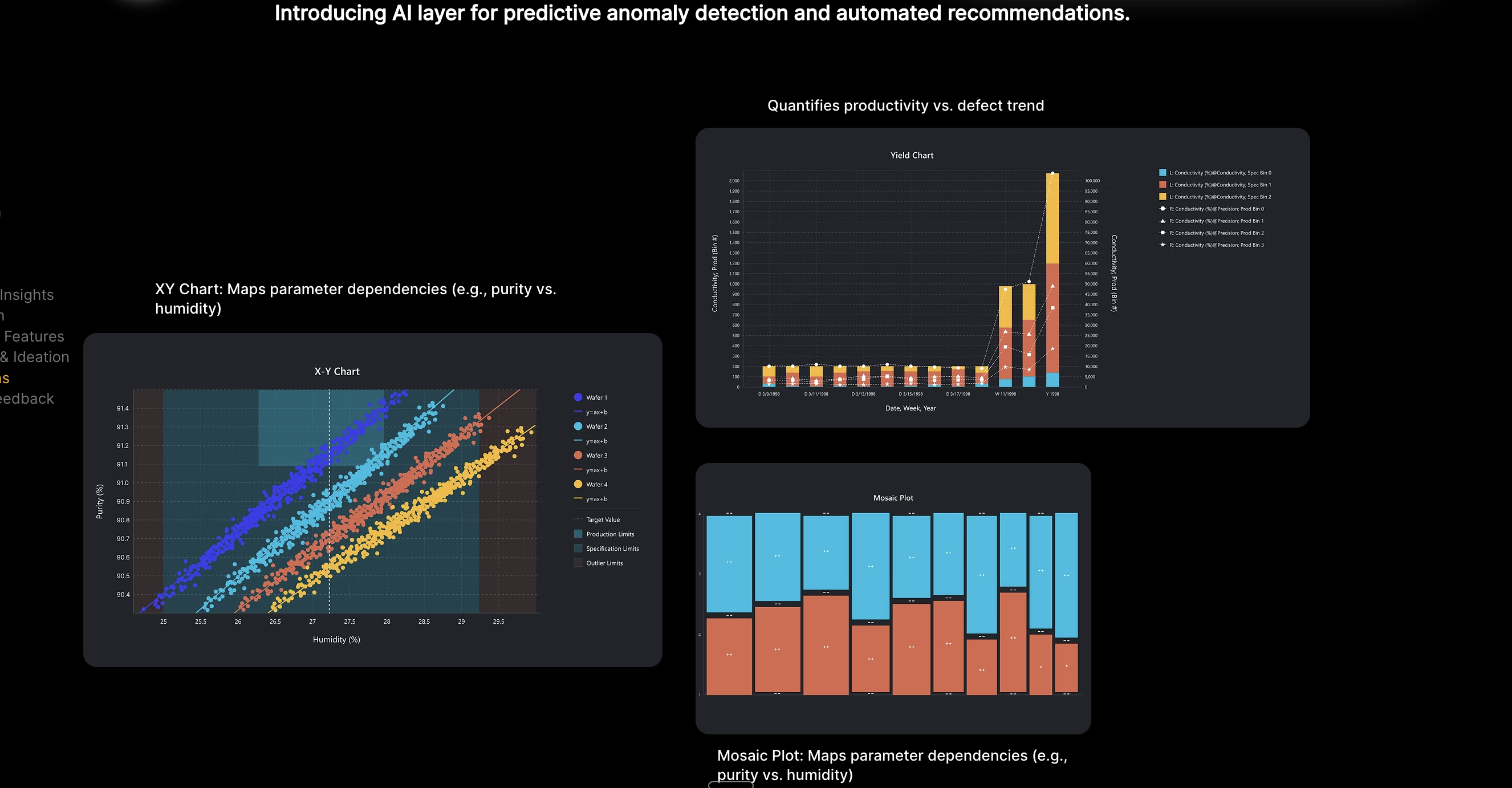
Analysis
Pareto, XY charts, yield views
Results
From months of guesswork to days of precision
| Metric | Before | After | |
|---|---|---|---|
| Defect resolution | 6 months | → | 2–3 days |
| Query turnaround | 4–6 hours (data team) | → | Under 5 minutes (self-serve) |
| Operational efficiency | Baseline | → | 30% improvement |
| Pre-sales conversion | Baseline | → | 25% · 4 enterprise customers |
Tested with 8 field service engineers and 2 product managers. 80% positive response. Shipped to Micron, Intel, GlobalFoundries, and Toshiba.
The Query Builder alone eliminated the 4-6 hour data team dependency. Engineers who previously filed tickets now run their own analyses before walking to the tool.
Testing & Validation
Validating in the environment that matters
Design reviews in a conference room can only tell you so much. The real test was putting Discover Fleet in front of engineers in the fab, where they're wearing cleanroom suits, reading screens at arm's length, and switching between the dashboard and the physical equipment they're debugging. I coordinated testing sessions at customer sites to validate the designs in situ.
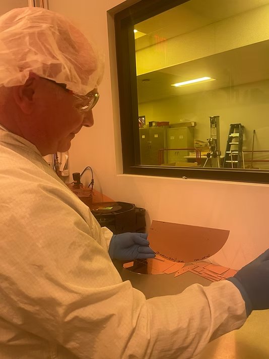
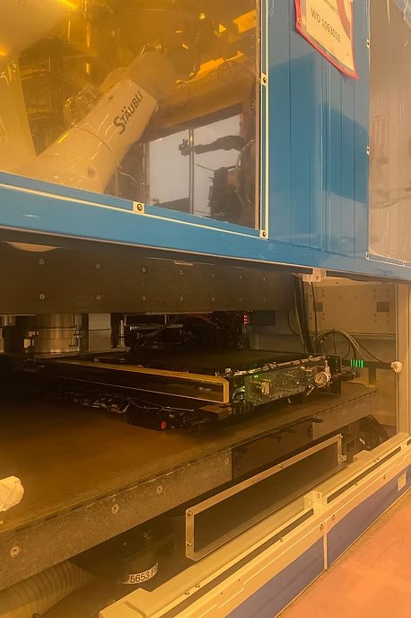
These sessions directly shaped design decisions. The health gradient color thresholds were calibrated for visibility under fab yellow lighting. Tile sizes were increased after watching engineers squint at the screen from two feet back. The drill-down hierarchy was simplified from four levels to three after observing that engineers consistently skipped the fleet-level aggregation and went straight to individual tools.
Key validation: 8 field service engineers tested the full flow (dashboard scan → drill-down → query). The average time to identify a drifting parameter dropped from "I'd file a ticket and wait" to under 5 minutes of self-serve investigation. Two engineers described it as "the tool I've been building in Excel for three years."
The Pivot
Discover Fleet shipped. It wasn't enough.
The dashboard gave engineers visibility. The Query Builder gave them speed. But GlobalFoundries Dresden was still seeing 210 interrupts per week. Engineers had the data. They were still drowning.
The problem wasn't data access anymore. It was cognitive overload. 12,847 signals across 217 tools across 4 data channels. No amount of self-serve querying could solve the triage problem: which of these 400+ alarms actually matters?
This realization led to Fleet Intelligence: an AI agent layer built on top of Discover Fleet's data foundation. Three agents (Monitor, Diagnose, Learning) that don't replace the engineer's judgment but augment it: grouping 400+ raw alarms into 47 actionable alerts, scoring diagnostic confidence across five states, and learning from every override to improve fleet-wide.
The connection: Every design decision in Discover Fleet, the unified data layer, the health index scoring, the drill-down hierarchy, became the foundation that Fleet Intelligence's AI agents rely on. The dashboard I built became the substrate for the AI I designed next.
Reflections
What I'd do differently
Start with the query, not the dashboard
The dashboard was our beachhead for adoption, but in retrospect, the Query Builder drove more behavioral change. Engineers who could ask their own questions stopped relying on the data team entirely. I'd validate the query model earlier.
Build the design system from day one
I created Fleet's component patterns incrementally as screens were built. By the third major feature, I was retrofitting consistency. A design system established upfront would have saved weeks of alignment and accelerated engineering handoff.
Instrument for learning, not just shipping
We didn't have analytics infrastructure to measure how engineers actually used the drill-down hierarchy. I'd push for event tracking from the first deployment. Understanding which paths engineers take tells you where the product should evolve.
Accessibility in a fab environment
Designed for cleanroom constraints: WCAG AA contrast throughout, color-blind safe encoding (text labels alongside color, never color alone), minimum 11px type for HMI compliance, and monospace signal names sized for arm's-length readability. The health gradient uses both position and color to communicate severity.